I have investigated into the kind of business cards I'd like to produce - from a book called The Best of Business Card Design...
I love the orange and white, its a great colour contrast, it really stands out. I like how it also works on the back with the black text.
This is the kind of business card I would like, its friendly, funny and eye catching at the same time. And it looks equally as effective on the back.
I like the colours used for these, more than the design. A set of three colours for my business cards could be interesting as it gives the reader the chance to select the one they prefer as opposed to taking one, that everyone else has. IT gives a bit of exclusivity.
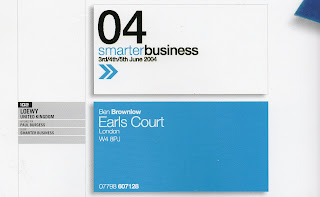
This is very corporate but I love the colours and how the hierarchy works within this. The arrows give a feeling of travel and mail and forward thinking, very appropriate and business-like.
These are quite playful in terms of the illustrative type. They work well and suit the business they are promoting.
I would like my next business cards to 'speak' to the reader.


No comments:
Post a Comment