Wednesday 29 February 2012

Youth Charity Logo Research

Not keen on this logo at all, apart from the fact its extremely pixelated, it seems really unbalanced and a bit wishy washy. Why is there a swoosh with angled corners and straight lines? Why are the lines of the people wobbly? A logo, specifically for youths needs to show stability and strength. That colour red also symbolises danger to me, not a charity that can help.


This is for the red cross in Singapore. I am not keen on the composition in terms of where the cross and Singapore is placed, this could look better if moved to the end for example. The choice of typeface for 'youth' does seem youthful as it is like a stroke from a paintbrush. I think the tone of blue is slightly loud and garish.


This logo seems rather corporate. The colour scheme works and communicates the location strongly, I guess the 'y' has quite a playful element to it which gives it a youthful appearance. The type choice seems suitable for the logo, its simple, legible and bold.


If this had a bit of refinery this could be effective. The overall visual communicates youth, especially the type face which is rather awful. Comic Sans should be banned. The multi-coloured fill with a different colour stroke doesn't really work. I think the positioning of the text could be in a better place. I like the vector image of the person jumping up, I think this works really well.


The typeface gives this a youthful feel and the fact its on an angle. The colour choice is rather odd, but strangely enough it works. The orange of the text binds together the other colours and softens the contrast.


I don't like this logo, the colour scheme doesn't work, the type choice doesn't seem appropriate and the blue splash looks more like a dolphin.The figures look rather scary, but I can see they are trying to represent energetic, lively young people.


This is quite a clever use of shapes to build letterforms YST, the colours and the white remind me of another sporting logo, for the Baseball Association. Without the type at the bottom I wouldn't actually have guessed it stood for YST. Especially with the S being like it is. Again, I can see where they have tried to go with this.


Indiependent Colours

This was sent through by the client to give me an idea of the 'yellow' they are looking for!


Indiependent Follow Up Call/New Brief

I spoke to the chairman of the charity today to discuss the ideas I have been feeding through, they have decided on an entirely different look and tone to the logo. I have formulated a new brief with this:
Suggested fonts from client:
One of the chairman's comments about my logo was that he liked the more three dimensional variations I had produced. This is something I will need to consider while designing.

On the phone the colours golden yellow was discussed, this needs clarification. I think of this colour like the D&AD logo so I will email it to them as a colour sample.

Tuesday 28 February 2012

Indiependent Logo Development 3

More ideas using the tittle of the i as a satellite. Not as keen on this although the concept is strong:

Meeting with Camilla (St Martins)

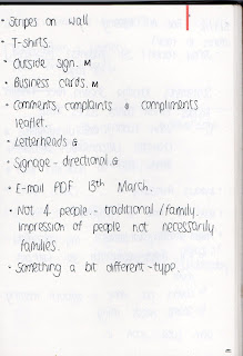
- After deciding on 3 concepts, she would like us to take them even further.
- Maya: liked handprints, when the logo was smaller it didn't have the same impact, try a different format/variation.
- Me: Colour change, don't like pastel, maybe not 4 people, too traditional. Give an impression of people but not necessarily families.

- 'Interesting shades of normal colours.'
- No pastels.
- Either NHS Blue or needs to work alongside it.
- Take ideas in several directions
- Typeface , more interesting.
- Think about incorporating values: caring, partnerships, openness.
(Circle = openness)
- 12 in clinical team

- Stripes on wall (consider colour)
- T-shirts
- Outside sign
- Business cards
- Comments, complaints and compliments leaflet front.
- Letterheads
- Signage - directional

- Email PDF 13th March

Monday 27 February 2012

Reorganising Team

Due to a complete lack of organisation, and distribution of files, I took it upon myself to get a complete register of the students - this should have been done long ago. I have no idea what is going on with the statements as Amy doesn't appear to have them any more.
I will then distribute students names to the group based on the names they have done already.

Natalie and Nick's list:


Kirsty and I:


Amy isn't doing any of the layouts and is doing a poster.

Yearbook Grid

Using the grid we agreed:


12 columns and 12 rows - 3mm gutter

Name:
- 3rd row down
- Latin Modern Roman Bold
- 14pt

Stroke:
- Same place/level on each page (directly in between title and body)
- 0.25pt

Body:
- Helvetica Neue Light
- 10 pt
- 14 pt leading
- Aligned with name

Contact:
- Bottom row
- Latin Modern Roman Regular
- 12pt
- 16 pt leading

Meeting with Camilla

Camilla wanted to discuss our ideas today, and prompt us on how she would like us to develop them further. Hopefully not too much as we can then get started on designing deliverables...


Fine Art Meeting


From this point forward Amy is in charge of the cover and spine.
Me and Kirsty are pairing up to do half of the layouts, and Nick and Nat will do the other half.

We are still waiting for the Course Ethos page!
Again, I have had to nag for missing images and statements...


Mini Evaluation

Where I am up to with each brief so far:

Brief 01 - Yearbook:
- Students need dividing up between team.
- Layout discussion between group - then to begin designing.
- Front Cover.
- Need to chase up statements and contacts...again.

Brief 02 - Fashion (Gemma Thurling):
- Awaiting Gemma's work to begin initial ideas.

Brief 03 - NHS:
- Waiting for feedback.

Brief 04 - ITV:
- Initial ideas - develop - storyboard.
- Need to learn Cinema 4D - gather books/tutorials.

Brief 05 - E4:
- To start.

Brief 06 - Indiependent:
- Initial ideas - mac - client.
- Colour font experimentation.

Brief 07 - Alton Towers:
- More ideas and experimentation.

Brief 08 - Fashion Film
- Meeting with Brian tomorrow.
- Meet with the girls to discuss ideas. (31st Jan)

Brief 09 - Design Context
- Ongoing research
- Finalising contact list.

Looking at this list I am able to see it looks like I am spreading myself quite thin. I am not definitely going to drop a brief but this is something I am considering in order to reach full potential with my work.

Design Context (9) is compulsory, the Yearbook (1) brief is pretty much compulsory and has moved too far to leave. The NHS (3) one is not definite until the client selects the successful pitch.

This leaves Briefs 2,4,5,6,7,8.
Brief 4 and 5 I feel are my briefs - the briefs where I can show what I'm about and what I enjoy, these are briefs I cannot drop. Brief 2 still hasn't started and I am not really sure whats going on. Brief 6 is ticking over nicely, and its an opportunity to do charity work and live work (looks good on the CV and is a good way of helping!), and Brief 8 I will find out about tomorrow.

Sunday 26 February 2012

Visuals for Fine Art Yearbook

Visuals for Fine Art meeting tomorrow:

- Unfortunately, I still didn't have the students names, statements or images to work out the layouts so I have just had to work on the front cover...again.
- We are still working individually and I really feel we should be working collaboratively, so instead of redesigning a new stamp, I have worked with Kirsty's stamp and experimented with size and stroke, before adding the toxic pink - agreed colour from last meeting.

I did have one students name and image, but no statement:


Experimenting with the stamp:


After seeing stars on another existing stamp, I wanted to trial it on mine:


I finally managed to get some images of students work, unfortunately the layouts for these students were already being done, so there was no point me doing them too. Slightly annoying but never mind.

I then took these images and began to form the glitch:


I then began muting the colours to get rid of the highly saturated colours coming through:


I then added in the stamp to give a more refined resolution: