Showing posts with label Brief 01 - Yearbook DC. Show all posts

Thursday, 22 March 2012

Chat with Mark Howe

We were feeling a bit lost with the Yearbook, so wondered what Mark's thoughts on the book were:


Quotes from Duffields


Judging by the quote for Fine Art and the actual budget, there won't be much chance of Sheila having the 1500 books she was wanting! And no chance of any special finishes!

Monday, 19 March 2012

Spin 'Stamp'

Sammy from Fine Art kindly donated some of her work from a previous year, that may help us develop the front cover. As a team we all really like these ideas and feel something may come of it, better than before!


Layered up these could create some really interesting designs.

Monday, 12 March 2012

Fine Art Meeting


There is a lot of negativity within the group at the minute, it doesn't help with the client. I have discovered that a lot of the images being sent through are basically of no use, as they are really low quality. I did urge them to send TIFFs at the start due to the higher quality but no one seemed bothered. Now the shit has hit the fan and its nearly the image deadline. 

Whats worse is Fine Art don't understand what we mean by 300 dpi, this is infuriating as Lorenzo offered them a workshop to make sure they sent through the correct spec for images, but Sheila declined.

Monday, 27 February 2012

Fine Art Meeting


From this point forward Amy is in charge of the cover and spine.
Me and Kirsty are pairing up to do half of the layouts, and Nick and Nat will do the other half.

We are still waiting for the Course Ethos page!
Again, I have had to nag for missing images and statements...


Friday, 24 February 2012

Type and Layout


An interesting use of type and layout - this may be too experimental for theYearbook, and not very representative of myself for the publication but it still looks cool. From dinasaurus.net

Wednesday, 15 February 2012

Stamps

Kirsty brought up the concept of using a type of authentication stamp, to show the work as 'original'. This seems like an interesting idea. I will have a look into other quality stamps and seals out there:


Glitch Art

I have discovered a site called Glitch Art - home to all sorts of weird and wonderful glitches. I guess it is a kind of art, and an original rework. You take something original and work into it to make it something completely different.

You can get some really interesting colour combinations in glitches, similarly you get some strange textures and qualities of line. They are a strange phenomenon really.

http://www.beflix.com/works/glitch.php


Painted Skyscraper:


This one reminds me of the QR codes you get:


Glitching in Context

I didn't really follow the glitching concept, so I have done some of my own visual research to grasp a better understanding:

This is a humourous video version of what is known as data moshing:
http://www.court13.com/Chairlift-EvidentUtensil.mov


This looks like a glitch from some spray paint on a wall:


TV 'data moshing':


I like how the blocks of RGB have interfered with this one:


From jk-keller Flickr:


Monday, 13 February 2012

M Exhibition Site

Until we are supplied with the correct and appropriate imagery, it was mentioned we can use content from the M Exhibition website.


Images from the catalogue:


Exhibition poster: 
(We may do a poster for the exhibition for F.A. - to be discussed)


Thursday, 9 February 2012

Publication Design


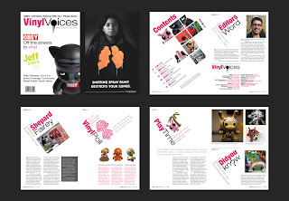
This is by Justin Zucco, it was an experimental project to design a magazine with all the usual magazine features. The theme is designer collectible toys. The look and feel had a street art like appearance that suited this topic well, because many street artists have created multiple vinyl toys. The pages are simple yet elegant to display information to the reader appropriately and easily.


This is also by Justin Zuco for MLCreative. Again, another simple, engaging, minimal publication, I love the colour green used here. MLCreative is a new media company, which the colour green seems to represent this freshness.


I love the Key Magazine design, the high impact image on the right really draws in the readers attention. The type on the left has quite a minimal feel, so we aren't over faced with paragraphs of text, this also keeps the attention of the reader, but gives it that classy, elegant, sophisticated edge.
From Autumn 2009.