Design Context Publication
The videos will not play in this format.
Showing posts with label OUGD303DC. Show all posts
Showing posts with label OUGD303DC. Show all posts
Tuesday, 29 May 2012

Monday, 21 May 2012
The Works Ltd
The Works did the UEFA Champions League Final event branding for Munich this year. It has a very Picasso/Cubist feel to it, especially with the blue colours, it reminds me of one of Picasso's pieces of a guitar player all in blue.
I must say after the Manchester Utd vs Manchester City game, I am not keen on blue right now, but I shan't bring football politics into this...!
Fantastic design, and the images below show how the branding will work across the deliverables, such as tickets, event entrance etc. I love how the colours have been used to create shapes which make up the whole image, for example the gradients in the blue have created a swoosh type shape for the 'footballer' on the right.


I must say after the Manchester Utd vs Manchester City game, I am not keen on blue right now, but I shan't bring football politics into this...!
Fantastic design, and the images below show how the branding will work across the deliverables, such as tickets, event entrance etc. I love how the colours have been used to create shapes which make up the whole image, for example the gradients in the blue have created a swoosh type shape for the 'footballer' on the right.


Monday, 7 May 2012
Current St Martins Practice Website
http://www.stmartinspracticeleeds.nhs.uk/

This is the current St Martins website, like the Burley Medical Practice site there doesn't appear to be any form of branding or logo. However, this is much brighter than the drab colour scheme of the other site. This site is more navigable and user-friendly, and even features the NHS logo.
It definitely will need revamping. Maya and I have decided to make a web proposal for Camilla.

This is the current St Martins website, like the Burley Medical Practice site there doesn't appear to be any form of branding or logo. However, this is much brighter than the drab colour scheme of the other site. This site is more navigable and user-friendly, and even features the NHS logo.
It definitely will need revamping. Maya and I have decided to make a web proposal for Camilla.
Sunday, 6 May 2012
Burley Park Medical Centre Website
http://www.burleyparkmedicalcentre.co.uk/

This is a screen grab from the Burley Park Medical Centre, my old doctors in Leeds. The colour scheme is very drab, and there just seems to be too many links on the homepage! There appears to be no form of branding or identity either. What I can take from this however, is the content that should be on a practice website. It is interesting to see no form of NHS logo, and this is an NHS doctors.

This is a screen grab from the Burley Park Medical Centre, my old doctors in Leeds. The colour scheme is very drab, and there just seems to be too many links on the homepage! There appears to be no form of branding or identity either. What I can take from this however, is the content that should be on a practice website. It is interesting to see no form of NHS logo, and this is an NHS doctors.
Monday, 30 April 2012
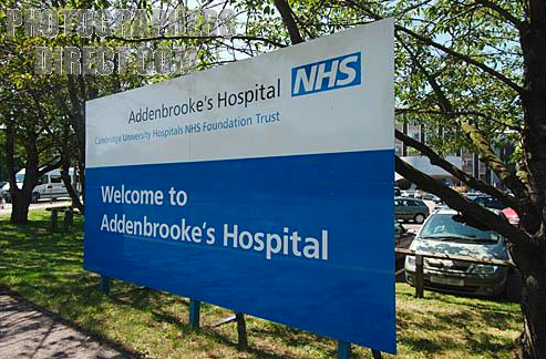
NHS External Signage
I have struggled to find any images of Doctors or General Practice signs, but I have found that they are similar in content and visual to hospital signage:


Saturday, 28 April 2012
NHS App
After I came up with the idea of the St Martins App, I thought it would be a good idea to see if there was any existing NHS Apps to see how they navigate:


The app seems very easy to navigate, and clear to understand, which is necessary to such a broad target audience.


The app seems very easy to navigate, and clear to understand, which is necessary to such a broad target audience.
Friday, 27 April 2012
Deliverables
Now Maya and I are closer to a final logo, we decided to draw up a list of deliverables that will be appropriate to the project- we emailed this to Camilla:
Hi Camilla,
Hi Camilla,
Hope you're well. Sorry for not emailing you earlier on today. I have attached a file with the oval and square logos mocked up on letterhead. We have also given you 3 variations of blue and 3 of purple so that you will be able to decide which colour you want to go with.
In terms of the deliverables, Gemma and I had a bit of brainstorming session. This is the list of possible products we could apply the logo to (some are obviously more suitable and important than others:
- External sign
- Interior signage (reception, waiting room, etc.)
- Way-finding/directional signage
- Signs for the doctors' doors
- Comments/complaints leaflet
- Business cards
- Appointment cards
- Letterhead
- Compliments slip
- St Martins Notepad
- Opening hours sign
- Name badges for the staff
- Uniform/t-shirts for staff
- Staff ID cards and lanyards (we aren't sure if something like this would be used?)
- Website
- An app which people could use to book appointments, check in for appointments and contact details for St Martins
- Pens
- Mugs
- Proposal for how the interiors could relate to the branding
- Overall brand guidelines as to how the logo and branding should be used to create a strong and consistent brand image
Please let us know if any of these would be of interest to you so that we can focus on developing them for you as soon as possible. Feel free to email or call us if you would like any clarification on anything at all. My (Maya) number is *************.
Looking forward to hearing the final logo and colour decisions from you at the beginning of next week.
Have a lovely weekend.
Tuesday, 24 April 2012
Friday, 20 April 2012
Indiependent: Deliverables
Just to make it clear to myself - I wanted to outline the deliverables:
- Logo
- Animated logo
- Badges - to distinguish volunteers from public.
- Sign - to distinguish the office from Let There Be Light Productions office (often confused).
- Letterhead
- Business Card
- With Compliments
- Invoice Template
- Donation Tub
- Pen
- Rubber Stamp
- Bag (Mocked Up)
Coffee House:
- Mug
- Towel - mocked up
- Apron - mocked up
- Microphone
- Plectrum
- Plectrum Holder
- Coaster
- T-Shirt
- Logo
- Animated logo
- Badges - to distinguish volunteers from public.
- Sign - to distinguish the office from Let There Be Light Productions office (often confused).
- Letterhead
- Business Card
- With Compliments
- Invoice Template
- Donation Tub
- Pen
- Rubber Stamp
- Bag (Mocked Up)
Coffee House:
- Mug
- Towel - mocked up
- Apron - mocked up
- Microphone
- Plectrum
- Plectrum Holder
- Coaster
- T-Shirt
Alan Smith (Creative in Motion)
http://www.creativeinmotion.co.uk/
Alan Smith teamed up with Gareth Price to design and produce the graphics for Glastonbury 2008. I have always liked the funky vector based motion work for Glastonbury, its very fitting, and I love the colour scheme, it reminds me of sunset and fields. Unfortunately the video can't be embedded but the link is here: http://www.creativeinmotion.co.uk/Glastonbury.html


Alan Smith teamed up with Gareth Price to design and produce the graphics for Glastonbury 2008. I have always liked the funky vector based motion work for Glastonbury, its very fitting, and I love the colour scheme, it reminds me of sunset and fields. Unfortunately the video can't be embedded but the link is here: http://www.creativeinmotion.co.uk/Glastonbury.html


He also did the branding for Shiver Productions, I applied for a work placement with them!! And every day on my work placement, in the ITV reception I was greeted by this animated logo before their show reel playing:
http://www.creativeinmotion.co.uk/Shiver.html

Thursday, 19 April 2012
The Partners


The Partners won a pitch to rebrand Wolf Theiss in 2007, they are an international law firm. The Partners had previous clients in the legal sector which may have been an advantage for their win.
The rebrand took a typographic focus with a strong, bold typeface representing the strong well established company itself. They needed to convey the attitude within the company aswell as the size and breadth of the knowledge - aswell as local knowledge and presence.
The design works really well across the range of deliverables, this is the brochure below:
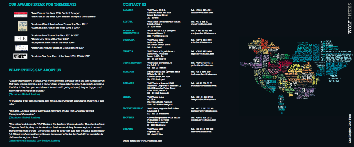

Taken from The Partners website:

Martin Rowlatt, consultant at The Partners, the rebrand will create a ‘distinctive look and feel that reflects the character and dynamism of the firm’.
Monday, 9 April 2012
Business Cards
I want my business cards to be really simple, a limited colour palette, but still bright!
I have investigated into the kind of business cards I'd like to produce - from a book called The Best of Business Card Design...


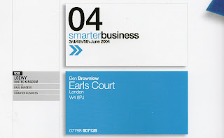

\From this, it seems I am quite attracted to a single bright colour and white, similar to my current business card colour palette. Bold chunky text also appears to be another common feature.
I would like my next business cards to 'speak' to the reader.
I have investigated into the kind of business cards I'd like to produce - from a book called The Best of Business Card Design...

I love the orange and white, its a great colour contrast, it really stands out. I like how it also works on the back with the black text.

This is the kind of business card I would like, its friendly, funny and eye catching at the same time. And it looks equally as effective on the back.

I like the colours used for these, more than the design. A set of three colours for my business cards could be interesting as it gives the reader the chance to select the one they prefer as opposed to taking one, that everyone else has. IT gives a bit of exclusivity.

This is very corporate but I love the colours and how the hierarchy works within this. The arrows give a feeling of travel and mail and forward thinking, very appropriate and business-like.

These are quite playful in terms of the illustrative type. They work well and suit the business they are promoting.
I would like my next business cards to 'speak' to the reader.
Thursday, 29 March 2012

Thursday, 22 March 2012
Meeting with Maya
I met up with Maya today to discuss our next pitch and how we are going to go about it:


Chat with Mark Howe
We were feeling a bit lost with the Yearbook, so wondered what Mark's thoughts on the book were:


Quotes from Duffields

Judging by the quote for Fine Art and the actual budget, there won't be much chance of Sheila having the 1500 books she was wanting! And no chance of any special finishes!

Crit Feedback
Today's crit was with Robyn R, Will Skane, Pav, Josh, Richard and Charlotte.
Most of the feedback I received was from Pav and Robyn.
- They advised me, at this point in the game to forget the Fashion Branding brief, it's too late on for a brief with absolutely nothing. My client has missed 2 meetings with me, and not delivered the required work. Major time lost.
- Storyboards and initial ideas for ITV and E4 brief - as it was hard for people with a non motion background to understand.
- Indiependent work - good to have live charity work.
- St Martins - not a lot to say, client driven, well under way.
- Yearbook - same with that.
* Blogs - I didn't receive any blog feedback, as this wasn't the focus of the discussion.
- They advised me, at this point in the game to forget the Fashion Branding brief, it's too late on for a brief with absolutely nothing. My client has missed 2 meetings with me, and not delivered the required work. Major time lost.
- Storyboards and initial ideas for ITV and E4 brief - as it was hard for people with a non motion background to understand.
- Indiependent work - good to have live charity work.
- St Martins - not a lot to say, client driven, well under way.
- Yearbook - same with that.
* Blogs - I didn't receive any blog feedback, as this wasn't the focus of the discussion.
Wednesday, 21 March 2012
Gangibob
http://www.gangibob.com/
They are a motion graphics studio based in Manchester. They love to push their creativity to the limits to create unique motion graphics and animation.
This is their showreel, demonstrating a variety of projects. What I seem to pick up from companies showreels is the amount of energy and high quality, impacting visuals. There never appears to be a dull moment, making them very dynamic and engaging.
Gangibob won first prize at D&AD for the yellow pencil award for its outstanding contribution to advertising. Watch the winning film: Simple but brilliantly executed.
They are a motion graphics studio based in Manchester. They love to push their creativity to the limits to create unique motion graphics and animation.
This is their showreel, demonstrating a variety of projects. What I seem to pick up from companies showreels is the amount of energy and high quality, impacting visuals. There never appears to be a dull moment, making them very dynamic and engaging.
Gangibob won first prize at D&AD for the yellow pencil award for its outstanding contribution to advertising. Watch the winning film: Simple but brilliantly executed.
Content for letterhead

Subscribe to:
Posts (Atom)