http://www.stmartinspracticeleeds.nhs.uk/
This is the current St Martins website, like the Burley Medical Practice site there doesn't appear to be any form of branding or logo. However, this is much brighter than the drab colour scheme of the other site. This site is more navigable and user-friendly, and even features the NHS logo.
It definitely will need revamping. Maya and I have decided to make a web proposal for Camilla.
Showing posts with label Brief 02 - St Martins DC. Show all posts
Monday, 7 May 2012
Sunday, 6 May 2012
Burley Park Medical Centre Website
http://www.burleyparkmedicalcentre.co.uk/
This is a screen grab from the Burley Park Medical Centre, my old doctors in Leeds. The colour scheme is very drab, and there just seems to be too many links on the homepage! There appears to be no form of branding or identity either. What I can take from this however, is the content that should be on a practice website. It is interesting to see no form of NHS logo, and this is an NHS doctors.
Monday, 30 April 2012
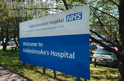
NHS External Signage
I have struggled to find any images of Doctors or General Practice signs, but I have found that they are similar in content and visual to hospital signage:
Saturday, 28 April 2012
NHS App
Tuesday, 24 April 2012
Thursday, 22 March 2012
Monday, 5 March 2012
Fine Art Meeting
We are fast approaching the deadline and still have images missing!
We have resolved the 'extra student' issue, Khadija and Dee are the same person!
Monday, 27 February 2012
Meeting with Camilla
Camilla wanted to discuss our ideas today, and prompt us on how she would like us to develop them further. Hopefully not too much as we can then get started on designing deliverables...
Friday, 17 February 2012
NHS Branding Guidelines
The NHS have strict guidelines for their branding - especially concerning the use of their logo. I have researched into how this works to inform my own design:
The image below shows why the NHS identity is important to a general practice.
The values of the NHS:
The exclusion zone is an important consideration when applying the logo to products/distributional materials:
The image below shows why the NHS identity is important to a general practice.
The values of the NHS:
The exclusion zone is an important consideration when applying the logo to products/distributional materials:
Equally as important is the positioning and height of the logo for materials:
From what I have worked out about how St Martins will use the NHS identity, I think it fits under category B:
Sunday, 12 February 2012
Medical Practice Logo: Engomis
This logo has a different approach to the typical, medical cross/equipment image. The colour gives a warm feeling especially with the rays coming out from the people like the sun, and the people figurines give a sense of community and family. I think the line splitting the text is unnecessary, and the idea of splitting up the image doesn't look good - it should all be included together to give a feeling of being inclusive.
Medical Practice Logo: Stock?
This, I believe is a stock medical logo, not sure what the point of a stock logo is to be honest. This in Camilla's eyes would be deemed as obvious. This is exactly what she doesn't want. The colours red and blue together reminds me of taps, magnets, thermometers, basically showing two extremes of a scale - I don't think this is what the logo should represent unless they are a boiler company! A well balanced colour would be more suited, like a green.
Medical Practice Logo: One Medicare
This is their website - it is clear to see how the lime green carries on throughout the design, it is also apparent that this blue swish has been incorporated, Camilla mentioned this in the briefing she gave us.
I quite like the logo minus the tagline. I love the use of green and blue together in this manner (I used these colours for my hospital art gallery brief last module) the lime green gives a sense of energy, health and well-being. Camilla made it very clear this green is not to be used in the St Martins branding.
Friday, 10 February 2012
Medical Practice Logos: Pike
I like the meaning of the logo with this one - I think the type completely ruins it. Firstly I think the black is quite harsh against the softer pastel tones used in the logo. The layout of the type is very messy - and the strange style of capitalisation or none at all doesn't work.
The image works, it represents medical with the stethoscope, and I like how thats been adapted into a heart, it also looks like 2 ears joined at the lobe, so that communicates the listening and hearts part. The different colours could also represent diversity.
I think with a rework of the text this could be a great identity.
Medical Practice Logo: Family Medical Centre
This is a stock logo available for purchase - so its not in circulation. Camilla would probably like how it promotes diversity, a tone she feels is important for the logo/branding to communicate. However, the cross would not be favoured. It is a simple clean, clear logo and communicates what it needs to.
Medical Practice Logos: Queenswood
I am not sure this communicates a medical practice, without the line 'medical practice' I would have thought it was a park or nature reserve. Especially with the colouring.
Medical Practice Logo: Doctor K's
I am looking at logo examples through Camilla's eyes, she would probably think this is too obvious. In my eyes it seems quite informal, almost verging on being jokey! Using an abbreviation which does make it seem relaxed but at the same time too relaxed, doctor's should take themselves seriously. Also, the use of the clip-art style image is something, Camilla definitely didn't like this.
Visually, it looks okay, but thats about it. I am not sure what the background pattern is for - it doesn't seem necessary.
Thursday, 9 February 2012
Medical Practice Logos: The Practice
Now this has identity, not amazing, but its simple and has a clinical, medical feel to it. The blues used are slightly dull, and seem depressing. I like the simplicity of the logo, the simple cross is a nice touch, if a little obvious.
Medical Practice Logo: Street Lane Practice
This again, has no identity whatsoever. There is no attempt to create a tasteful design, or an engaging site for viewers. There is no logo but a photograph of a stethoscope, (as we are told, photos should be taken on a white background - I rest my case), which has had the opacity manipulated to fade into the white background. If the image had been taken properly, on a white background, it would create a more clinical approach to this miserable visual.
There are a series of dots on the right hand side which appear to serve no purpose whatsoever. Again, some really bizarre text alignment, with Welcome and the rest of the text underneath?
The drab green colour has occurred again, with a strange green colour.
Medical Practice Logos: Ireland Wood
This company was identified by Camilla as successful but lacking identity. Again, entirely true, this looks like a Microsoft Office template - with awfully aligned text for the top right opening times. There is a use of this dull blue and green again, very miserable drab colours, enough to make anyone ill.
Subscribe to:
Posts (Atom)