Design Context Publication
The videos will not play in this format.
Showing posts with label Brief 06 - Design Context DC. Show all posts
Showing posts with label Brief 06 - Design Context DC. Show all posts
Tuesday, 29 May 2012

Monday, 21 May 2012
The Works Ltd
The Works did the UEFA Champions League Final event branding for Munich this year. It has a very Picasso/Cubist feel to it, especially with the blue colours, it reminds me of one of Picasso's pieces of a guitar player all in blue.
I must say after the Manchester Utd vs Manchester City game, I am not keen on blue right now, but I shan't bring football politics into this...!
Fantastic design, and the images below show how the branding will work across the deliverables, such as tickets, event entrance etc. I love how the colours have been used to create shapes which make up the whole image, for example the gradients in the blue have created a swoosh type shape for the 'footballer' on the right.


I must say after the Manchester Utd vs Manchester City game, I am not keen on blue right now, but I shan't bring football politics into this...!
Fantastic design, and the images below show how the branding will work across the deliverables, such as tickets, event entrance etc. I love how the colours have been used to create shapes which make up the whole image, for example the gradients in the blue have created a swoosh type shape for the 'footballer' on the right.


Friday, 20 April 2012
Alan Smith (Creative in Motion)
http://www.creativeinmotion.co.uk/
Alan Smith teamed up with Gareth Price to design and produce the graphics for Glastonbury 2008. I have always liked the funky vector based motion work for Glastonbury, its very fitting, and I love the colour scheme, it reminds me of sunset and fields. Unfortunately the video can't be embedded but the link is here: http://www.creativeinmotion.co.uk/Glastonbury.html


Alan Smith teamed up with Gareth Price to design and produce the graphics for Glastonbury 2008. I have always liked the funky vector based motion work for Glastonbury, its very fitting, and I love the colour scheme, it reminds me of sunset and fields. Unfortunately the video can't be embedded but the link is here: http://www.creativeinmotion.co.uk/Glastonbury.html


He also did the branding for Shiver Productions, I applied for a work placement with them!! And every day on my work placement, in the ITV reception I was greeted by this animated logo before their show reel playing:
http://www.creativeinmotion.co.uk/Shiver.html

Thursday, 19 April 2012
The Partners


The Partners won a pitch to rebrand Wolf Theiss in 2007, they are an international law firm. The Partners had previous clients in the legal sector which may have been an advantage for their win.
The rebrand took a typographic focus with a strong, bold typeface representing the strong well established company itself. They needed to convey the attitude within the company aswell as the size and breadth of the knowledge - aswell as local knowledge and presence.
The design works really well across the range of deliverables, this is the brochure below:
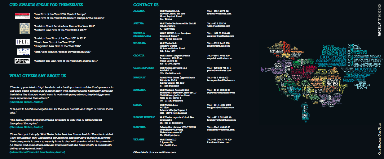

Taken from The Partners website:

Martin Rowlatt, consultant at The Partners, the rebrand will create a ‘distinctive look and feel that reflects the character and dynamism of the firm’.
Monday, 9 April 2012
Business Cards
I want my business cards to be really simple, a limited colour palette, but still bright!
I have investigated into the kind of business cards I'd like to produce - from a book called The Best of Business Card Design...


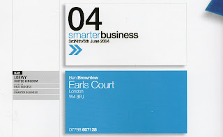

\From this, it seems I am quite attracted to a single bright colour and white, similar to my current business card colour palette. Bold chunky text also appears to be another common feature.
I would like my next business cards to 'speak' to the reader.
I have investigated into the kind of business cards I'd like to produce - from a book called The Best of Business Card Design...

I love the orange and white, its a great colour contrast, it really stands out. I like how it also works on the back with the black text.

This is the kind of business card I would like, its friendly, funny and eye catching at the same time. And it looks equally as effective on the back.

I like the colours used for these, more than the design. A set of three colours for my business cards could be interesting as it gives the reader the chance to select the one they prefer as opposed to taking one, that everyone else has. IT gives a bit of exclusivity.

This is very corporate but I love the colours and how the hierarchy works within this. The arrows give a feeling of travel and mail and forward thinking, very appropriate and business-like.

These are quite playful in terms of the illustrative type. They work well and suit the business they are promoting.
I would like my next business cards to 'speak' to the reader.
Thursday, 29 March 2012

Wednesday, 21 March 2012
Gangibob
http://www.gangibob.com/
They are a motion graphics studio based in Manchester. They love to push their creativity to the limits to create unique motion graphics and animation.
This is their showreel, demonstrating a variety of projects. What I seem to pick up from companies showreels is the amount of energy and high quality, impacting visuals. There never appears to be a dull moment, making them very dynamic and engaging.
Gangibob won first prize at D&AD for the yellow pencil award for its outstanding contribution to advertising. Watch the winning film: Simple but brilliantly executed.
They are a motion graphics studio based in Manchester. They love to push their creativity to the limits to create unique motion graphics and animation.
This is their showreel, demonstrating a variety of projects. What I seem to pick up from companies showreels is the amount of energy and high quality, impacting visuals. There never appears to be a dull moment, making them very dynamic and engaging.
Gangibob won first prize at D&AD for the yellow pencil award for its outstanding contribution to advertising. Watch the winning film: Simple but brilliantly executed.
Friday, 9 March 2012

Monday, 5 March 2012
We Are Boy
http://www.weareboy.co.uk/
Based in Manchester Boy is a small company producing 3D work, whether its still or animated. From their website they clearly demonstrate professionalism but with an obvious sense of humour, read about Boy:

Their showreel, the funky music keeps the tone upbeat and makes an interesting viewing experience:


Based in Manchester Boy is a small company producing 3D work, whether its still or animated. From their website they clearly demonstrate professionalism but with an obvious sense of humour, read about Boy:

Their showreel, the funky music keeps the tone upbeat and makes an interesting viewing experience:


An ident for Kiss, this very much suits the tone and style for Kiss. Its young, upbeat and exciting. It also doubles up as an info-motion graphic. An effective way of showing their statistics.
Paul Woodward
http://www.paul-woodward.co.uk/
"In short, after graduation I began work as a motion graphics designer for an independent TV production company where I was schooled in the art of camera, editing, and direction."
This is someone I want to email, he has described my exact plan for after I leave LCA.
This is an effective way of visually showing non-motion work - this is the kind of thing I need to be thinking about for my showreel! This is Paul's actual showreel and shows a wide range of techniques used to generate the content for it, it's dynamic, engaging and short enough to keep my attention span:
"In short, after graduation I began work as a motion graphics designer for an independent TV production company where I was schooled in the art of camera, editing, and direction."
This is someone I want to email, he has described my exact plan for after I leave LCA.
This is an effective way of visually showing non-motion work - this is the kind of thing I need to be thinking about for my showreel! This is Paul's actual showreel and shows a wide range of techniques used to generate the content for it, it's dynamic, engaging and short enough to keep my attention span:
Showreel March 2011 from Paul Woodward on Vimeo.
Fine Art Meeting
We are fast approaching the deadline and still have images missing!
We have resolved the 'extra student' issue, Khadija and Dee are the same person!


We have resolved the 'extra student' issue, Khadija and Dee are the same person!


Sunday, 4 March 2012


Saturday, 25 February 2012
E-Sting Runners Up 2009
Albinal:
This is okay, but I'm not sure its representative of E4 or its values and audience. It would be suitable more for Cartoon Network or Boomerang perhaps.
This is okay, but I'm not sure its representative of E4 or its values and audience. It would be suitable more for Cartoon Network or Boomerang perhaps.
Friday, 24 February 2012
E- Sting Competition 2008
Philip Swaine:
This is a humourous video, incorporating film with some simple animation post production. I can see how this has made it to second prize, its entertaining and engaging.
Tim B and Fred R:
This is a simple but cool motion graphic, with a play on the word discoraphy, animated vinyls, move across the white roll to form the E4 logo. Although this has not incorporated the E4 colour palette it still works.
Terry Lewis:
This is an entertaining sting, a set of images we are all probably familiar with on those cards tucked into the back of the seat in front of you in a plane. This is a much more light hearted take on the visual, incorporating the purple and white colour palette, however, I do feel the logo colours should have not been tampered with.
This is a humourous video, incorporating film with some simple animation post production. I can see how this has made it to second prize, its entertaining and engaging.
Tim B and Fred R:
This is a simple but cool motion graphic, with a play on the word discoraphy, animated vinyls, move across the white roll to form the E4 logo. Although this has not incorporated the E4 colour palette it still works.
Terry Lewis:
This is an entertaining sting, a set of images we are all probably familiar with on those cards tucked into the back of the seat in front of you in a plane. This is a much more light hearted take on the visual, incorporating the purple and white colour palette, however, I do feel the logo colours should have not been tampered with.
Type and Layout

An interesting use of type and layout - this may be too experimental for theYearbook, and not very representative of myself for the publication but it still looks cool. From dinasaurus.net
Tuesday, 21 February 2012
Hello Charlie
Well its been the Brits tonight, so I had my eyes peeled for the end credits as to who the Graphic Designers were behind the design...Hello Charlie.
Based in Bristol they have a very impressive client list, and have produced some wonderful pieces of work.
Their showreel demonstrates a range of high end motion graphics, and film, unfortunately I can't embed it:
http://www.hellocharlie.co.uk/uploads/c34afeab28ace921b3877fd59de5b942.flv
They have designed a stunning ident for Disney and did the motion screens behind Coldplays tours in South America and Europe. Below are some screen shots from their exciting and energetic showereel:


Based in Bristol they have a very impressive client list, and have produced some wonderful pieces of work.
Their showreel demonstrates a range of high end motion graphics, and film, unfortunately I can't embed it:
http://www.hellocharlie.co.uk/uploads/c34afeab28ace921b3877fd59de5b942.flv
They have designed a stunning ident for Disney and did the motion screens behind Coldplays tours in South America and Europe. Below are some screen shots from their exciting and energetic showereel:


Monday, 20 February 2012
E-Stings
This is the trailer for the E-Sting competition featuring stings from previous years.
E4 has a competition every year for its viewers to design the latest E-Sting. Teamed up with Creative Review, there is the chance to win a cash prize, and the use of the chosen E-Sting on air.
The rules:
(a) it has to be something E4 can show in the daytime. So ease up on the exploding heads, guts, animal torture, toilet-based unpleasantness, full frontal nudity, etc. We won't be able to show it, which makes all of your lovely effort unfortunately a bit...pointless.
• (b) It HAS to be EXACTLY 10 seconds long. If it's not 10 seconds long IT WILL NOT BE CONSIDERED BY THE JUDGES. Sorry, but we're feeling a bit strict this year. To make things easier we’re providing you with a choice of 10 second audio beds which you are welcome to use in your E STING (but feel free to use something of your own if you prefer!)
• (c) It HAS to have the E4 logo in it... But you probably knew that.
Other than that it can be live-action or animation, big budget or no budget.
Thursday, 9 February 2012

Saturday, 4 February 2012
Book Layout
This is an experimental layout representing counter culture taking over high society.

I like the use of pink and white on black - it makes a nice contrast and gives the design impact. The linking of the ampersands looks effective, although I am not sure what it represents.

I like the use of pink and white on black - it makes a nice contrast and gives the design impact. The linking of the ampersands looks effective, although I am not sure what it represents.
Thursday, 2 February 2012
Subscribe to:
Posts (Atom)