My rationale has remained the same throughout this module; I have continued to focus on branding and promotion across print and motion. However, my statement of intent has changed, in particular the briefs I intended to do at the start. I had to drop the Fashion Branding due to the client being slow in getting back to me, which has been an issue across a lot of the live briefs I’ve worked on.
The Yearbook and St Martin’s brief have been the most stressful, which is down to the clients. For example, the St Martins brief was extremely slow due to the client not being able to pick who she wants to work on the branding, resulting in re-pitching several times. Even when she picked Maya and I, we still had to pitch one more time, in the end; we have had to produce some of the other deliverables outside of the FMP due to it holding up our schedule and individual deadlines we had. Thankfully, this did not affect the working relationship between Maya and I. This is a slightly different situation with the Yearbook brief as there were group tensions from the start, but we have ended on a positive note and can look back and learn from errors.
I have learnt a new program this module also, for Brief 04 – E4 and Brief 03 – ITV2, as the kind of visuals I had in my head were not possible to produce in After Effects so I started to learn Cinema 4D end of February, beginning of March. At first, I was wondering if this would mean my ideas would be inhibited slightly due to a lack of knowledge, but it actually set me free. I was able to produce whatever ideas I had written down, and I am really pleased with the colours and quality of the finished pieces. Especially the E4 deliverables, I think the music really refines it and makes it more final than my ITV2 idents where I would have liked to have had a narrator talking over the top, but finding somebody without a strong accent, who would be willing to record audio may be more hassle than its worth.
I am glad I did the E4 and ITV2 brief, as it was a chance for me to do what I wanted to do and enjoy, and it is something I would be proud to have in my portfolio, plus it gives me more content for a showreel. I am equally as glad I did the other briefs as they were a chance to work with clients, one on my own, one with Maya and one with Nick Morgan, Natalie Jackson and Kirsty Hair, so it gave me an all round experience.
As always, I think time management has been a weak point, writing this evaluation now, I can think of many things I should have done, which unfortunately at this time is tough, as I can’t have another go.
Relating to the issue of time is the motion graphics work itself, as much as I have a real passion and spark for creating this kind of work, especially in Cinema 4D where it has that high quality, glossy look, this is disadvantaged by the time taken to render and work with it. For example, to render my Discoball Ident for ITV2 with a duration of 10 seconds, it took 2 hours to render.
In terms of my boards, I am pleased with the way they are, they show what I have done for each brief, and I am actually surprised at how well the motion briefs turned out as the images came straight from Cinema 4D which is RGB, as when I changed them in Photoshop to CMYK, they became murky. An error with the printer and paper stocks has resulted in me having 3 different stocks for my boards.
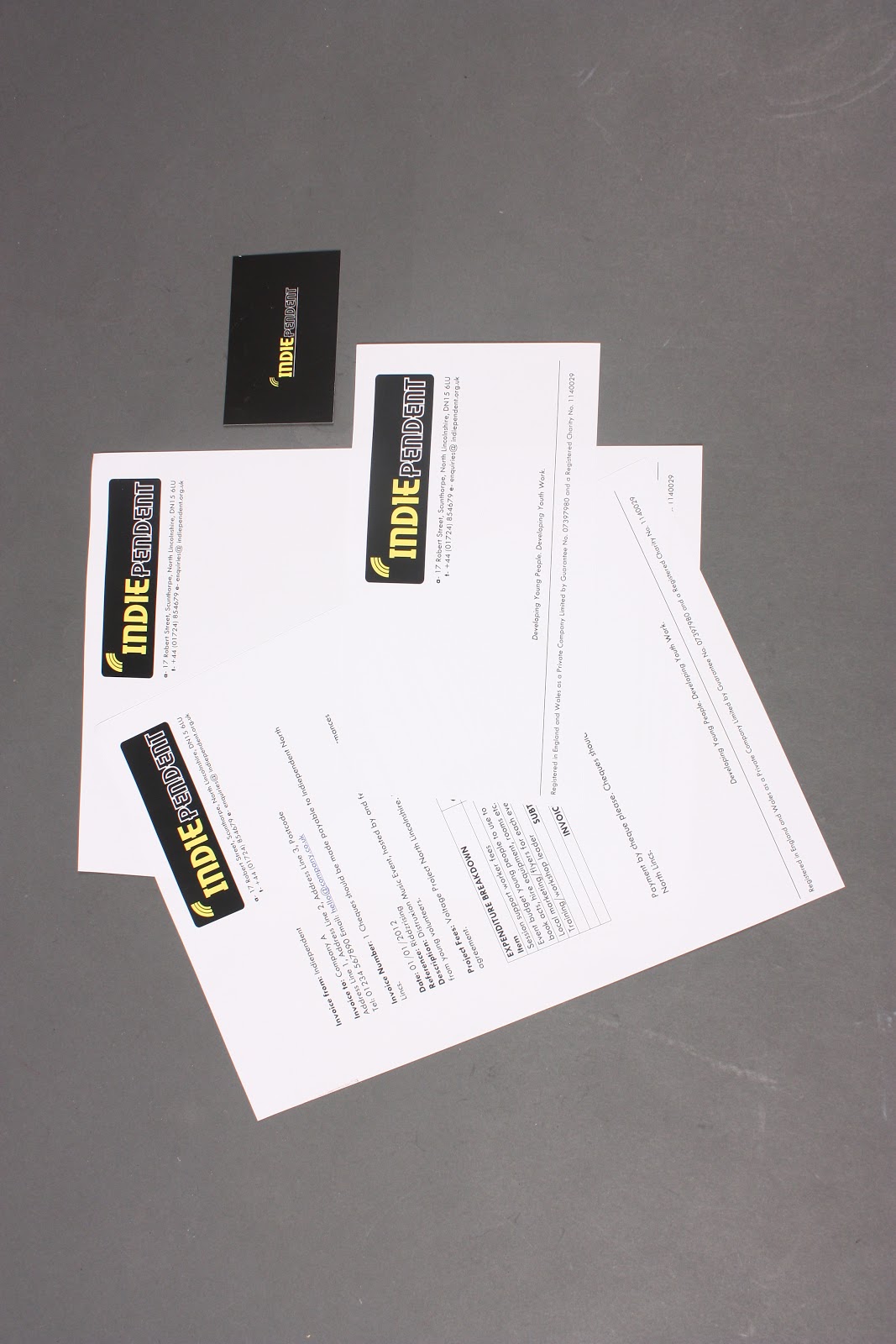
With respect to my final products, some of my St Martins work was water damaged when I wasn’t in the studio, so reluctantly I have handed some in. This was the same for the Indiependent brief, a few deliverables were ruined but they have been photographed, although they all needed reshooting after advice from the Final Crit.
Without the chances to work on live briefs this module, I don’t feel I would have been ready to work with clients straight after university. The learning experience from these briefs have prepared me in a way I wouldn’t have achieved without the Final Major Project on this course.
Looking back over my work, from the past three years, I am shocked at how my work has developed, and how my pathway within Graphics has changed. I started the course interested in type and layout for campaigns and posters, and now I am more image based interested in motion graphics, for branding and promotion.
My blogging has really let me down this module, there is a lot of development work missing for Briefs 3 and 4, and I am worried this will have a huge effect on my marks.
I feel I have worked to the best of my ability, with the exception of poor time management, and I have learnt a lot about myself personally and professionally. I walked in to the course, naïve and unconfident, and now I feel my confidence has built up and I know what I want to do next. Touch wood, this is a positive end to the year, and the course.
Showing posts with label Brief 05 - Indiependent DP. Show all posts
Showing posts with label Brief 05 - Indiependent DP. Show all posts
Wednesday, 30 May 2012

Tuesday, 29 May 2012
Brief 05 - Final Boards


Thursday, 24 May 2012




Tuesday, 8 May 2012
Final Plectrum

This is the design selected by the client for the plectrums. These will be printed on one side only.
Final Apron

This is the apron design the client selected this is due to the practicality of the colour black in a food environment and the size of the logo. The central positioning reflects the alignment on the business card.


Saturday, 5 May 2012
Microphone Designs
As the coffee house will be a live music venue - it would be good to have the logo on the microphone - the bigger the better, especially for when the events may be photographed for publicity.
Open publication - Free publishing
Friday, 4 May 2012
Business Card Designs 2
This is the second batch of business cards I have come up with - I prefer the first set of black cards on the previous business cards, they fit better with the brand.
Open publication - Free publishing
T-Shirt Designs
These t-shirts could be used for anything related to Indiependent, and not just the coffee house.
Open publication - Free publishing
Thursday, 3 May 2012
Apron Designs
For the coffee house:
I think black will be the more suitable colour choice, not just because of the brand colours but for practical matters as well - stains and marks will be less visible.
I think black will be the more suitable colour choice, not just because of the brand colours but for practical matters as well - stains and marks will be less visible.
Wednesday, 2 May 2012
Plectrum Designs
This idea has come to light after a recent chat about the deliverables I am to produce - the charity would like to run a coffee house run by young volunteers - it is to have a arts/music theme to display/show emerging local talent.
The plectrum designs and colours have stuck strictly by the logo palette. The name has varied throughout as I often hear my client refer to the charity as Indie - but I equally like the I variations too.
I have sourced a company to print these professionally:
http://www.razmerch.com/musical/index.html
Tea Towel Ideas
This was a deliverable I came up with, I have sent the ideas to the client and I am awaiting feedback. I thought it would be another way to expose the name. I will be most likely to stick with a black unless the client says different for practical reasons.
Open publication - Free publishing
Saturday, 28 April 2012
Business Card Designs 1
This is the first batch of business card designs I have come up with:
Open publication - Free publishing
Coaster Designs
These are a set of coaster designs - I would hope the client may like to go down the route of making the coaster look like a mini vinyl in order to reinforce the concept of the music venue/coffee house.
Open publication - Free publishing
Friday, 20 April 2012
Indiependent: Deliverables
Just to make it clear to myself - I wanted to outline the deliverables:
- Logo
- Animated logo
- Badges - to distinguish volunteers from public.
- Sign - to distinguish the office from Let There Be Light Productions office (often confused).
- Letterhead
- Business Card
- With Compliments
- Invoice Template
- Donation Tub
- Pen
- Rubber Stamp
- Bag (Mocked Up)
Coffee House:
- Mug
- Towel - mocked up
- Apron - mocked up
- Microphone
- Plectrum
- Plectrum Holder
- Coaster
- T-Shirt
- Logo
- Animated logo
- Badges - to distinguish volunteers from public.
- Sign - to distinguish the office from Let There Be Light Productions office (often confused).
- Letterhead
- Business Card
- With Compliments
- Invoice Template
- Donation Tub
- Pen
- Rubber Stamp
- Bag (Mocked Up)
Coffee House:
- Mug
- Towel - mocked up
- Apron - mocked up
- Microphone
- Plectrum
- Plectrum Holder
- Coaster
- T-Shirt
Saturday, 14 April 2012


Thursday, 22 March 2012
Crit Feedback
Today's crit was with Robyn R, Will Skane, Pav, Josh, Richard and Charlotte.
Most of the feedback I received was from Pav and Robyn.
- They advised me, at this point in the game to forget the Fashion Branding brief, it's too late on for a brief with absolutely nothing. My client has missed 2 meetings with me, and not delivered the required work. Major time lost.
- Storyboards and initial ideas for ITV and E4 brief - as it was hard for people with a non motion background to understand.
- Indiependent work - good to have live charity work.
- St Martins - not a lot to say, client driven, well under way.
- Yearbook - same with that.
* Blogs - I didn't receive any blog feedback, as this wasn't the focus of the discussion.
- They advised me, at this point in the game to forget the Fashion Branding brief, it's too late on for a brief with absolutely nothing. My client has missed 2 meetings with me, and not delivered the required work. Major time lost.
- Storyboards and initial ideas for ITV and E4 brief - as it was hard for people with a non motion background to understand.
- Indiependent work - good to have live charity work.
- St Martins - not a lot to say, client driven, well under way.
- Yearbook - same with that.
* Blogs - I didn't receive any blog feedback, as this wasn't the focus of the discussion.
Wednesday, 21 March 2012
Content for letterhead

Subscribe to:
Posts (Atom)