Just to make it clear to myself - I wanted to outline the deliverables:
- Logo
- Animated logo
- Badges - to distinguish volunteers from public.
- Sign - to distinguish the office from Let There Be Light Productions office (often confused).
- Letterhead
- Business Card
- With Compliments
- Invoice Template
- Donation Tub
- Pen
- Rubber Stamp
- Bag (Mocked Up)
Coffee House:
- Mug
- Towel - mocked up
- Apron - mocked up
- Microphone
- Plectrum
- Plectrum Holder
- Coaster
- T-Shirt
Friday, 20 April 2012
Interim Evaluation
As its Easter I felt this would be an ideal time to reflect on where I am up to, and what needs doing in order for my briefs to reach full potential - as I know I am probably not as far on as I should be.
With the Yearbook brief there have been lots of ups and downs, it didn't help having to restart the project after a member left the group, but I feel we are now in a much stronger position than we were before. Even after our hiccup I feel we have progressed further than other groups, we have the layouts sorted, and nearly all of the information and images. Just a few odds and ends that need tying up.
The key considerations in this brief have been the clients requirements, they have been quite picky about what we have done, and so its our job to pay attention to what they say in order to go away and design something that makes them say wow. I feel quite happy with the progress with this in general.
The difference from where we are at now to our initial ideas is astonishing - we have moved on so much - and this has pleased the client as they weren't so keen on Amy Leigh's original concepts which seemed slightly 'out there' for what they actually want.
I am glad I decided to end the Fashion Brief with Gemma, it was moving far too slow for me, and I didn't want to feel rushed towards the end.
The St Martins brief is still moving ever so slow, we are still pitching, and this is beginning to become a bit of a problem now. The key consideration for this brief is Camilla and the patients, we have to consider Camilla's requirements which are quite vague of late, but we also need to consider the patients as every walk of life will walk through that door and see that logo - it needs to be easy to understand, clear, non offensive, non discriminatory, and welcoming. Maya and myself have done research into existing medical logos including the competition for St Martins which is One Medicare. We have looked into the different kinds of deliverables, taking into account the NHS branding guidelines which we have taken very seriously and studied carefully, always referring back to when designing something new.
Our breadth of initial ideas have probably been too extensive, we have spent an awfully long time on 'initial ideas' through no fault of our own and we need to push Camilla gently into selecting someone to work with.
I have learnt a lot about competing for a pitch here, I never thought of it as a competition until the other 'pitcher' had told the entire year group one of the ideas Maya had come up with was a copy. Its at this point where Camilla is realising what she wants and there have been similarities in ideas, surely this is a good thing.
The ITV2 brief is still moving very slowly, but I fully intend to give myself a kick up the bottom and get on with producing the motion as this is going to be very time consuming - especially in Cinema 4D. I would have liked to have got this one nearly finished over Easter but due to my ITV placement I am now 2 weeks behind schedule.
E4 brief I still haven't started I regret to admit - I do not feel very motivated towards this although I know this is my chance to 'shine'. Again, this should have been really under way throughout Easter but my work placement has got in the way slightly, which means some serious hard work when I return.
The Indiependent brief is going well, the client is happy with the work I have done so far, I just need to really push this to its full advantage.
I am glad I decided to end the Fashion Brief with Gemma, it was moving far too slow for me, and I didn't want to feel rushed towards the end. I am equally as glad about ending the Alton Towers brief and the Fashion Promo Video brief, I think I would be in a far worse situation if I had continued with them.
Alan Smith (Creative in Motion)
http://www.creativeinmotion.co.uk/
Alan Smith teamed up with Gareth Price to design and produce the graphics for Glastonbury 2008. I have always liked the funky vector based motion work for Glastonbury, its very fitting, and I love the colour scheme, it reminds me of sunset and fields. Unfortunately the video can't be embedded but the link is here: http://www.creativeinmotion.co.uk/Glastonbury.html


Alan Smith teamed up with Gareth Price to design and produce the graphics for Glastonbury 2008. I have always liked the funky vector based motion work for Glastonbury, its very fitting, and I love the colour scheme, it reminds me of sunset and fields. Unfortunately the video can't be embedded but the link is here: http://www.creativeinmotion.co.uk/Glastonbury.html


He also did the branding for Shiver Productions, I applied for a work placement with them!! And every day on my work placement, in the ITV reception I was greeted by this animated logo before their show reel playing:
http://www.creativeinmotion.co.uk/Shiver.html

Thursday, 19 April 2012
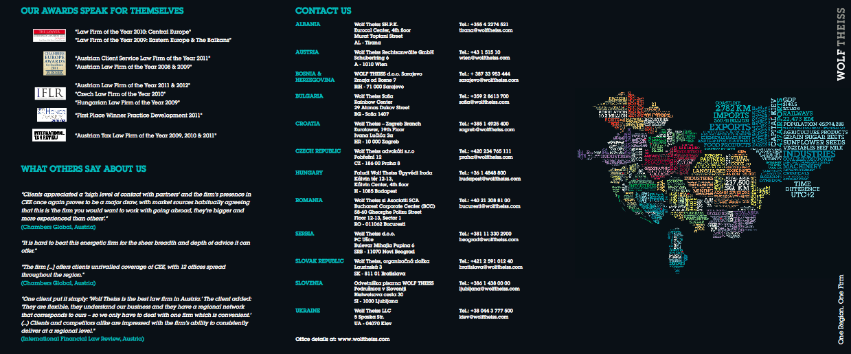
The Partners


The Partners won a pitch to rebrand Wolf Theiss in 2007, they are an international law firm. The Partners had previous clients in the legal sector which may have been an advantage for their win.
The rebrand took a typographic focus with a strong, bold typeface representing the strong well established company itself. They needed to convey the attitude within the company aswell as the size and breadth of the knowledge - aswell as local knowledge and presence.
The design works really well across the range of deliverables, this is the brochure below:

Taken from The Partners website:

Martin Rowlatt, consultant at The Partners, the rebrand will create a ‘distinctive look and feel that reflects the character and dynamism of the firm’.
Saturday, 14 April 2012


Monday, 9 April 2012
Business Cards
I want my business cards to be really simple, a limited colour palette, but still bright!
I have investigated into the kind of business cards I'd like to produce - from a book called The Best of Business Card Design...


\From this, it seems I am quite attracted to a single bright colour and white, similar to my current business card colour palette. Bold chunky text also appears to be another common feature.
I would like my next business cards to 'speak' to the reader.
I have investigated into the kind of business cards I'd like to produce - from a book called The Best of Business Card Design...

I love the orange and white, its a great colour contrast, it really stands out. I like how it also works on the back with the black text.

This is the kind of business card I would like, its friendly, funny and eye catching at the same time. And it looks equally as effective on the back.

I like the colours used for these, more than the design. A set of three colours for my business cards could be interesting as it gives the reader the chance to select the one they prefer as opposed to taking one, that everyone else has. IT gives a bit of exclusivity.

This is very corporate but I love the colours and how the hierarchy works within this. The arrows give a feeling of travel and mail and forward thinking, very appropriate and business-like.

These are quite playful in terms of the illustrative type. They work well and suit the business they are promoting.
I would like my next business cards to 'speak' to the reader.
Tuesday, 3 April 2012


Subscribe to:
Comments (Atom)